High bois lane
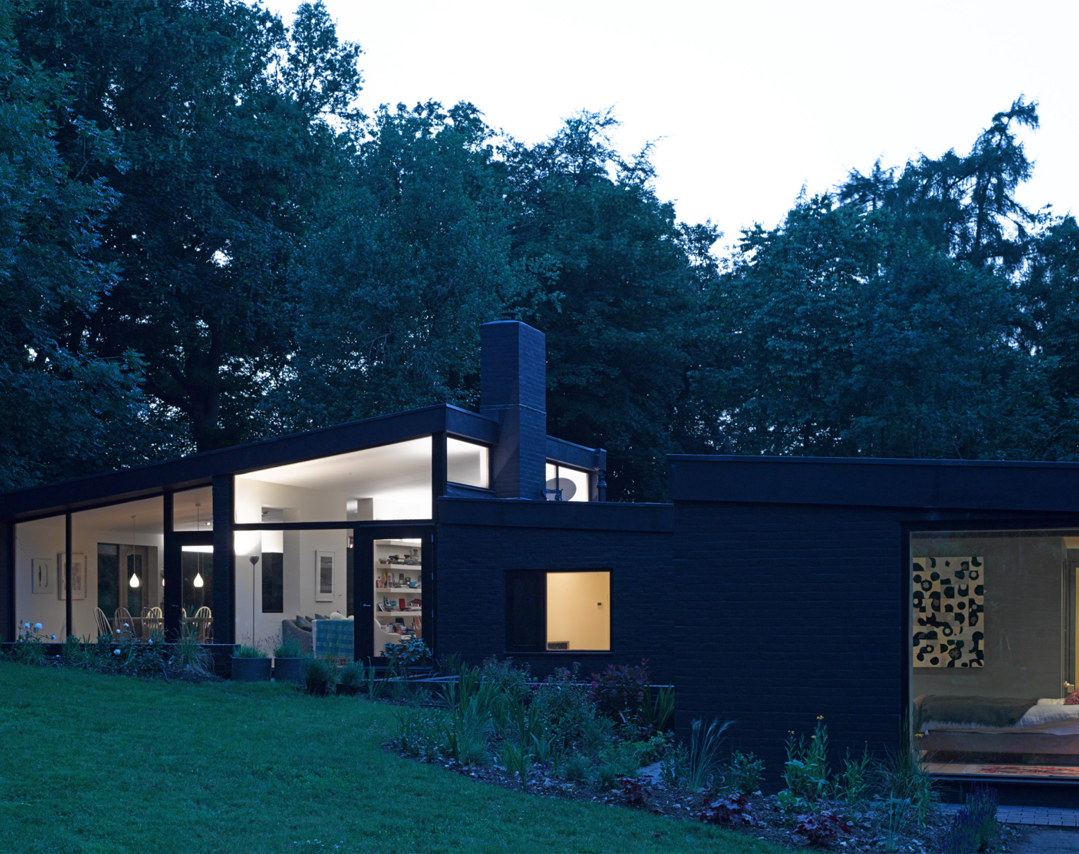
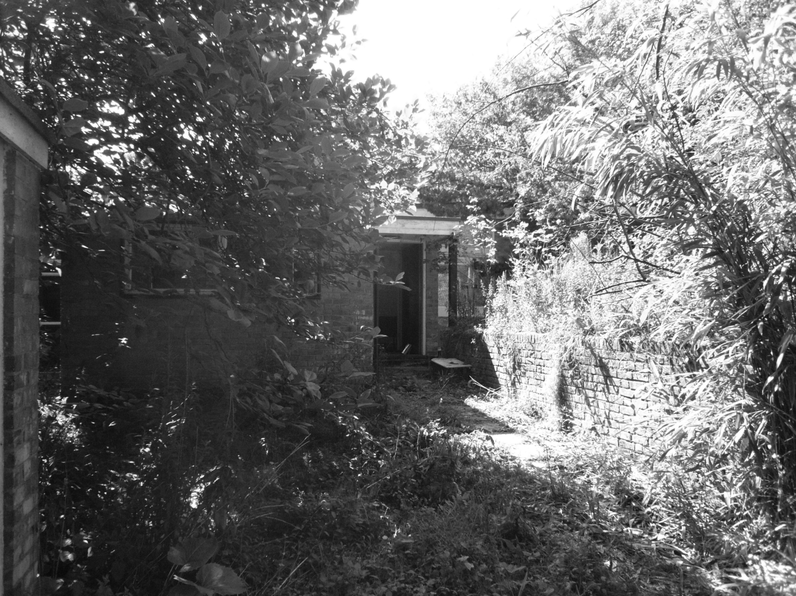
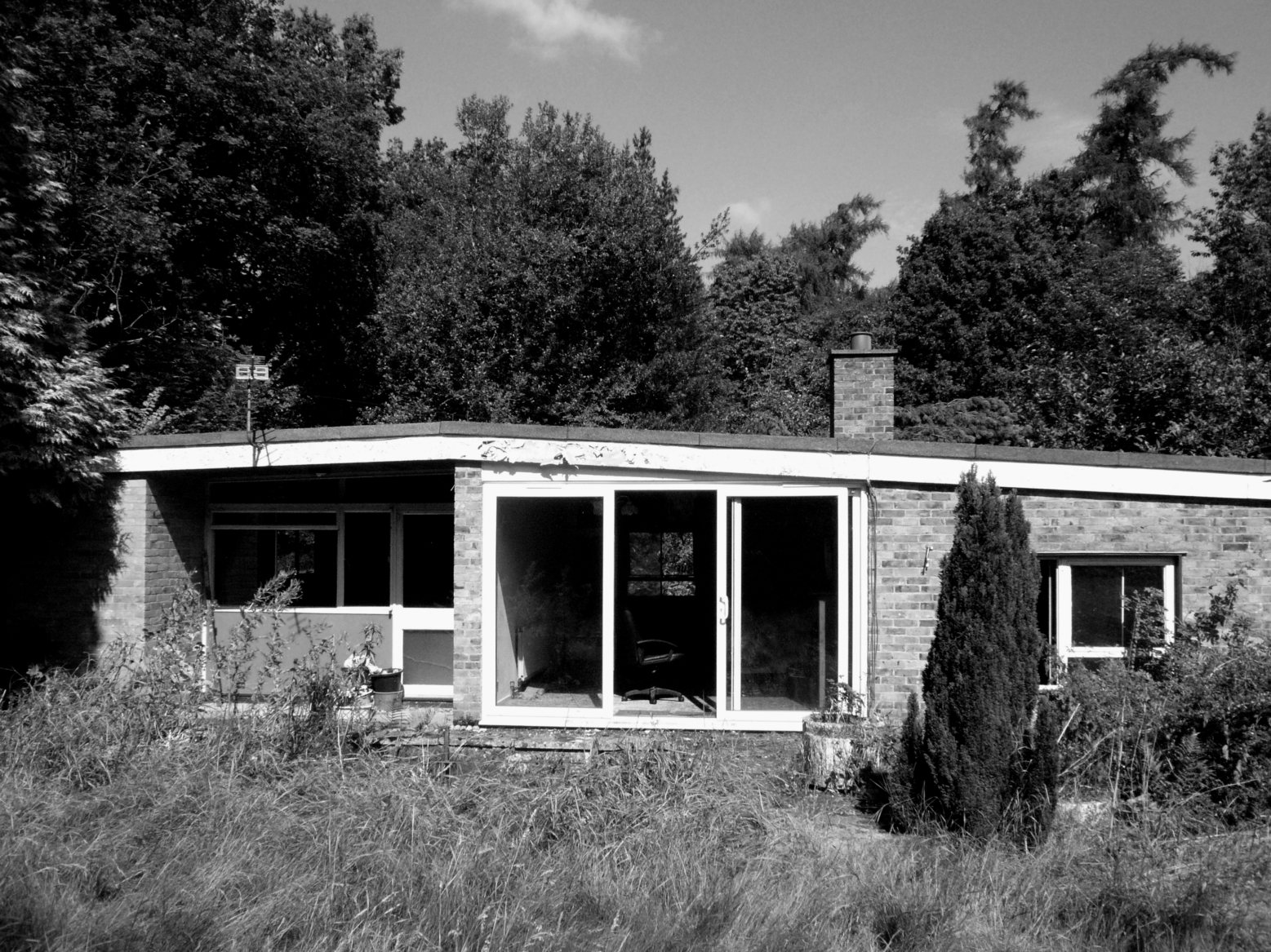
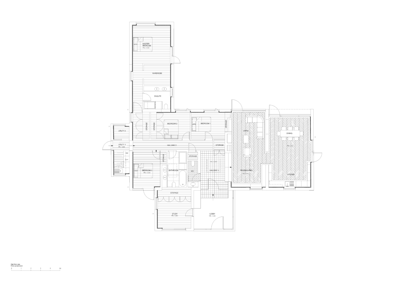
Sited next to the local church deep in the Bois Wood, on the outskirts of Amersham, a derelict 1960s modernist bungalow was renovated in 2013. Reflecting the economic downturn post 2008 and with a limited project budget, the design developed out of the architectural language of the original house; the owners and the architects working as much as possible to maximize the existing structure and site.

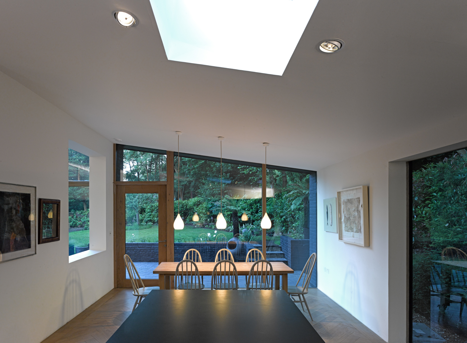
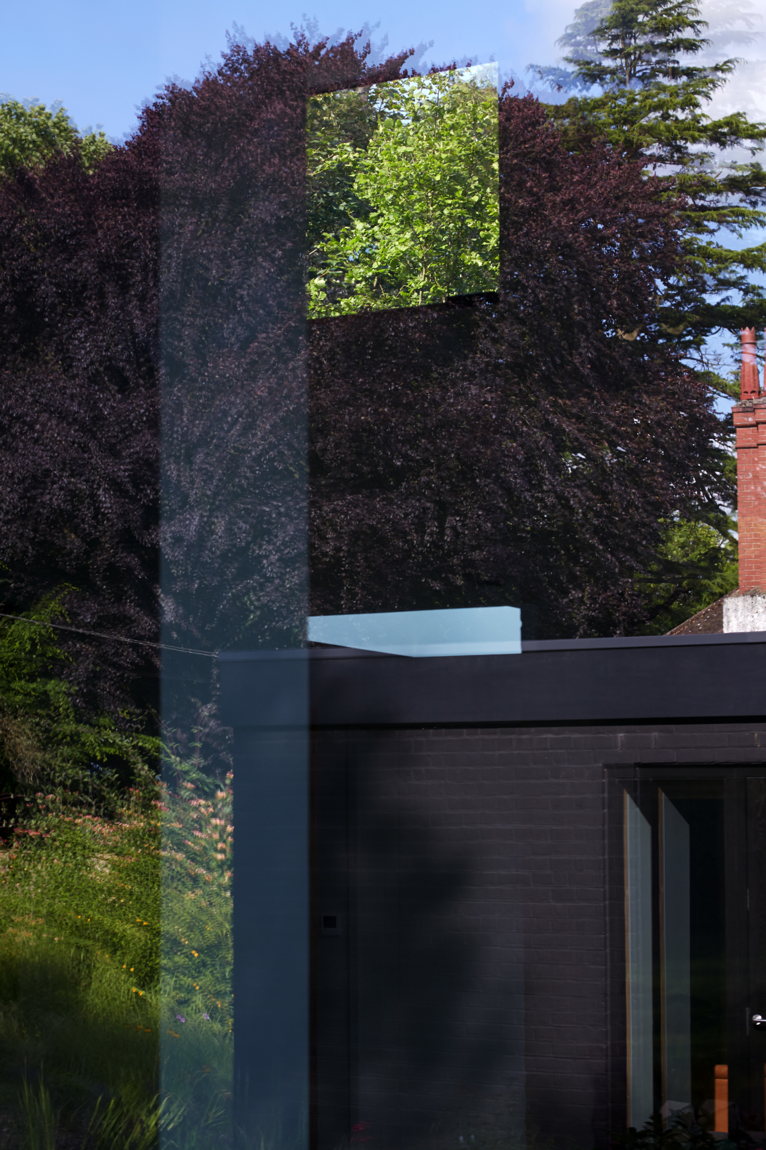
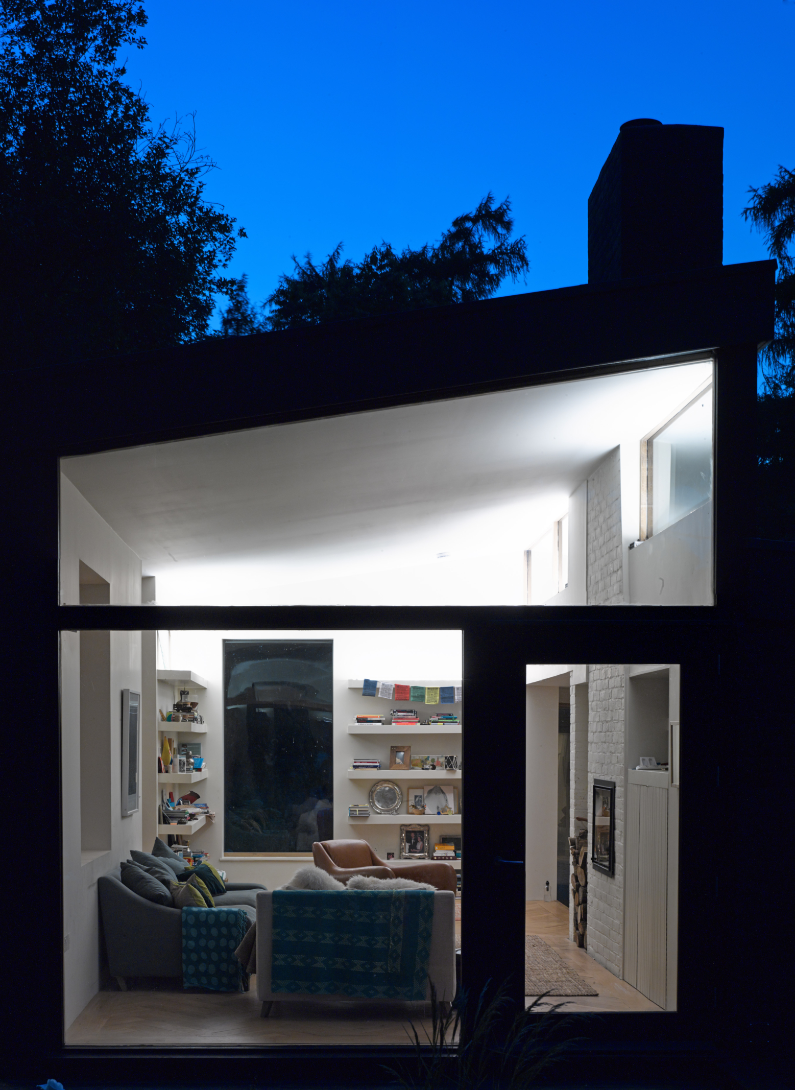
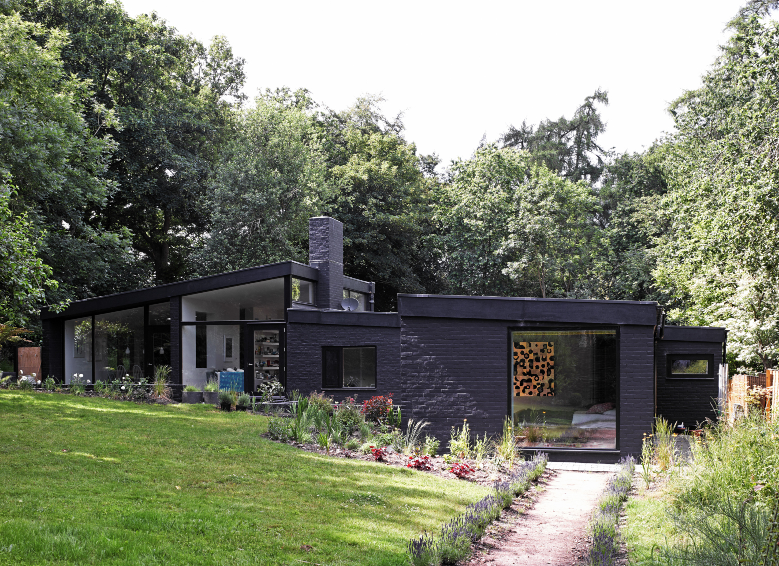
‘Aperture in the Woods’
In 2010, the client bought the site and the house, which had been vacant for three years and in a poor state of repair. Whilst the existing house was not a building of significant design importance, there was a spirit there worth preserving and enhancing, that of post war British modernism.
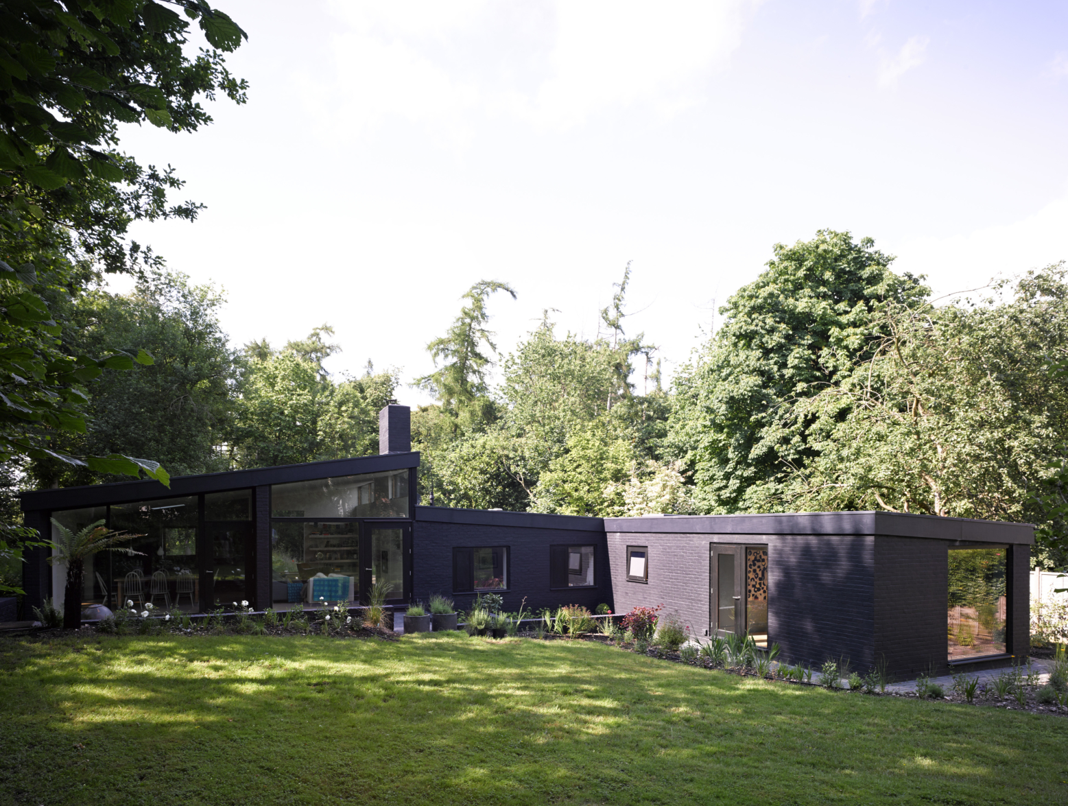
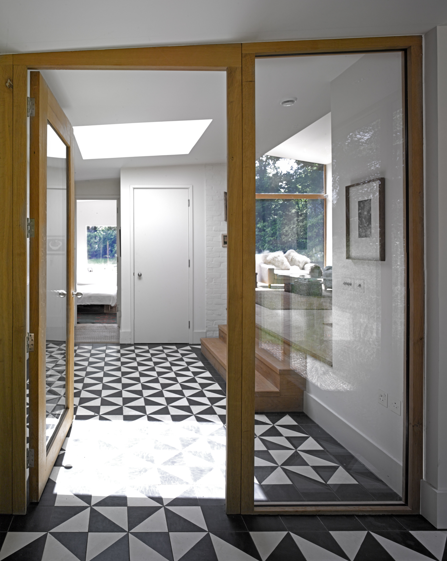
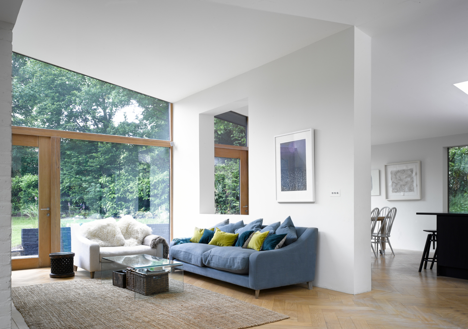
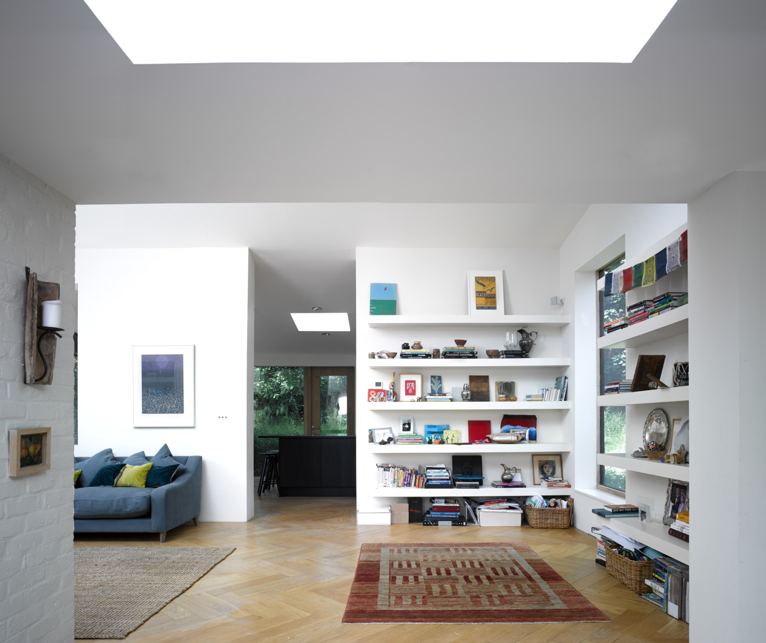
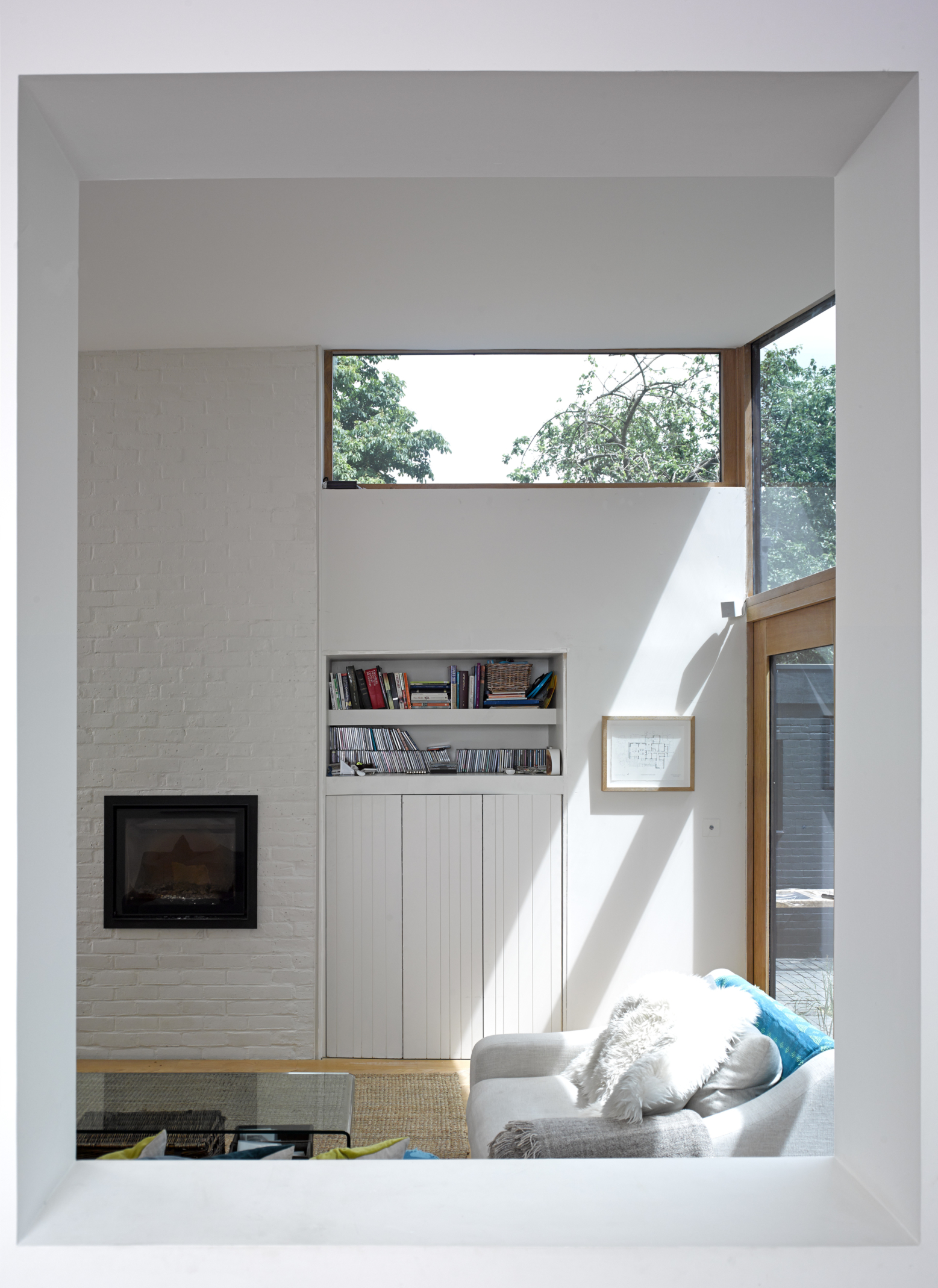
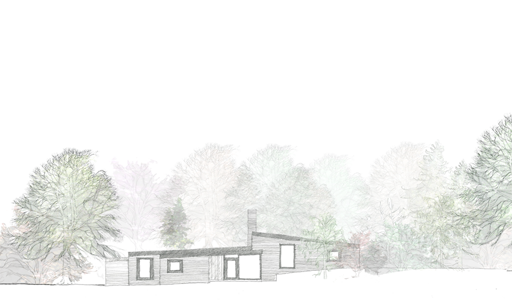
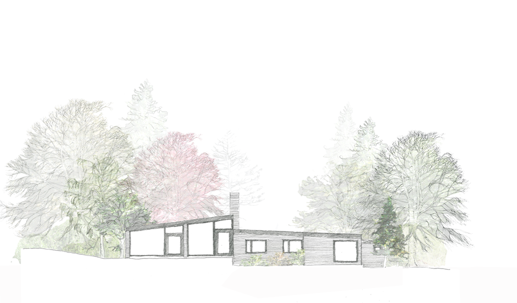
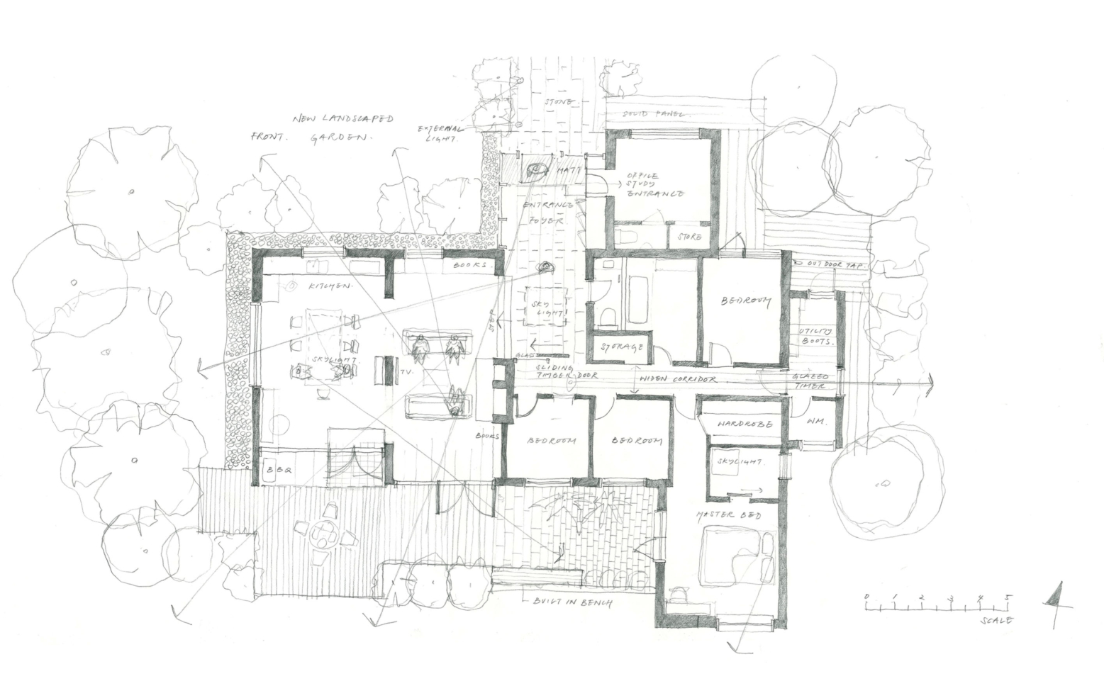
Views of the woodland surroundings were created with careful changes to the existing openings, with additional apertures focusing on specific viewpoints including the church, immediate and distant woods and the newly planted wild flower garden to the front of the house. The roof of the living area was also raised to give a greater connection with the woodland. This also changed the exterior presence of the architecture and provided some much needed boldness to the elevations. The house became transparent and transformed into a different entity.
Most of the original brickwork was retained and added too. It was clear that no matter how carefully we tried to match the brick a homogenous finish would not be achieved. It was decided to paint the brick and black was chosen to make the house recede into the shadows created by the surrounding woodlands.
Without any curtains or blinds, the house is a transparent black viewing box, its external walls reflecting or absorbing the surrounding nature throughout the seasons. The interior is realized in a light grey tone with all joinery including windows and doors in oak. The contrast of dark and light makes this building highly ephemeral and reflects the family’s aspirations for more dynamic living spaces.
The house is Phase 1 of 3 phases that will include additional spaces for quieter activities such as a study/guest house (Phase 2) and a green house (Phase 3). The project was a collaboration between t-sa and Charlie Luxton.
t-sa Team: Takero Shimazaki, Jennifer Frewen, Meiri Shinohara
_
Photographs
Edmund Sumner